# 封装echarts
假如后台提供的初始数据如此:
{
    "xAxis": [
        "01月",
        "02月",
        "03月",
        "04月",
        "05月",
        "06月",
        "07月",
        "08月",
        "09月",
        "10月",
        "11月",
        "12月"
    ],
    "series": [
        {
            "name": "系列一",
            "value": [
                320,
                302,
                301,
                334,
                390,
                330,
                320,
                202,
                403,
                200,
                314,
                330
            ]
        }

    ]
}
# echarts series
# echarts 饼图
- label的位置:outside inside center(圆环图中心)
  series: [
    {
      type: 'pie',//类型
	  // 如果使用环图,需要注意是['25%','40%']
	  // 小值放前面,否则虽然呈现时没有什么异常
	  // 但是label引导线就会从小值那边计算,会出现问题
      radius: '25%',
      center: ['50%', '50%'],
      data: data,
      label: {
        position: 'outer',
        // formatter: '{b}:\n {d}',
        formatter:function(params){
          console.log(params)
          return `{style1|${params.name}:}\n{style2|${params.value}}`
        },
        rich:{
          style1:{
            color:'orange'
          },
          style2:{
            color:"green"
          }
        }

      },
      labelLine:{
        length:10,//线条第一段长度
        length2:60,//线条第二段长度
        // smooth: true //是否曲线
      },
	  // 顺时针还是逆时针排布
	  clockWise: false,
	  // 设置false,则emphasis里的scale就不需要再设置了
	  // 可以更方便关闭悬浮动画
	  hoverAnimation: false,
	  // 强调,悬浮触发label
	  emphasis: {
		  label: {
			show: true,
			fontSize: 40,
			fontWeight: 'bold'
		  },
		  // 如果不需要饼图悬浮变大,可关闭
		 scale:false
		},
	 itemStyle: {
		borderRadius: 10,//饼图每一块的边的角度,
		borderColor: '#FFF',
		borderWidth: 10,////饼图每一块的边的宽度,如果填充背景色和花不一致,看上去像是镂空
		opacity:0.2// 圆环透明度
	  },
    },


  ]
# 饼图label文字旋转方向
// 求和,计算 label 的旋转角度
let sum = 0;
dataList.forEach((val)=> {
    sum += val.value;
});
let seriesData = [];
let addDeg = 0;
let deg = 0;
for (let i = 0; i < dataList.length; i++) {
    // 计算 label 的旋转角度
    addDeg = addDeg + (dataList[i].value/sum*360);
    deg = addDeg - (dataList[i].value/sum*180);

    seriesData.push({
        value: dataList[i].value,
        name: dataList[i].name,
        label:{
            rotate:deg
        }
    });
}


let seriesOption = [{
    type: 'pie',
	// 注意上述的addDeg和deg时按逆时针设置的,如果要按顺时针,需要调整
	// addDeg = addDeg - (dataList[i].value/sum*360);
	// deg = addDeg + (dataList[i].value/sum*180);
    clockWise: false,
    radius: ['60%', '80%'],
    hoverAnimation: false,
    itemStyle: {
        normal: {
            label: {
                show: true,
                position: 'inside',
                color: 'red',
                formatter: function(pram){
                    return pram.data.name + pram.percent+'%'
                },
                padding:[50,0, 0, 0],

            }
        }
    },
    data: seriesData
},
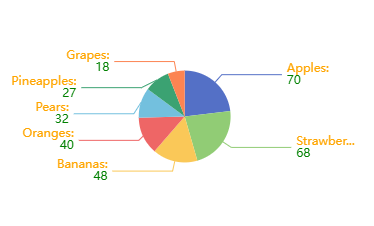
# 饼图格式化和富文本样式formatter
饼图字符串模板 模板变量有:
- {a}:系列名。
- {b}:数据名。
- {c}:数据值。
- {d}:百分比。
- {@xxx}:数据中名为 'xxx' 的维度的值,如 {@product} 表示名为 'product' 的维度的值。
- {@[n]}:数据中维度 n 的值,如 {@[3]} 表示维度 3 的值,从 0 开始计数。
 formatter: '{b}:\n {d}'

 formatter: [
        '{a|这段文本采用样式a}',
        '{b|这段文本采用样式b}这段用默认样式{x|这段用样式x}'
].join('\n')

 formatter:function(params){
  return `{style1|${params.name}:}\n{style2|${params.value}}`
}
注意富文本格式
# echars 饼图自动轮播 高亮和选择
dispatchAction中设置type downplay和highlight控制高亮与否
    window.requestAnimationFrame(()=>{
         if (i === 0) {
            cache.htmlChart.dispatchAction({
                type: 'downplay',
                seriesIndex: 0, //第几个系列
                dataIndex: seriesDataLen - 1 //第几个下标
            });
        } else {
            cache.htmlChart.dispatchAction({
                type: 'downplay',
                seriesIndex: 0,
                dataIndex: i - 1
            });
        }
        cache.htmlChart.dispatchAction({
            type: 'highlight',
            seriesIndex: 0,
            dataIndex: i
        });

        cache.htmlChart && cache.htmlChart.setOption(option, true);
    })
这个操作会影响到emphasis,悬浮的时候可能会出现重影
// 避免悬浮时环形label重叠,,但是中间label颜色有点加深
option.series[0].label.formatter = `{style1|${labelName}}\n{style2|${labelValue}}\n{style3|${labelPercent}%}`

cache.htmlChart && cache.htmlChart.setOption(option, true);
# highlight 和 select模式不同之处
- 使用高亮模式,可以后接setOption,label利用emphasis呈现出来。
- 使用select选择,会让饼图有脱离原来的范围的一个offset偏移,但是如果自定义修改了option再去执行,则会不起作用,而利用自身的label,则label会存在一定的偏离情况 需要设置的属性
- selectedMode: 'single',
- selectedOffset:20,
/**
 * selectedMode: 'single',
	* selectedOffset:20,
 */
option.series = [{
    type: 'pie',
    radius: ['60%', '70%'],
    center: ['37%', "50%"],
    name: '图例1',
    data: newSeriesData || [],
    selectedMode: 'single',
      selectedOffset:20,
      // 选中的样式
      select: {
        label: {
          show: true,
          //   formatter:`{style1|{b}}`,
          rich:{
            style1:{
              textAlign:'right',
              color:'red',
            }
          }
        }
    },


}];


 myChart.dispatchAction({
		type: 'select',
		seriesIndex: 0,
		dataIndex: 0
	});
select 模式会让中心文字有些偏移,如果不像偏移,可以再创建一个系列,selectedOffset设置为0,配置select属性和label(label为false)
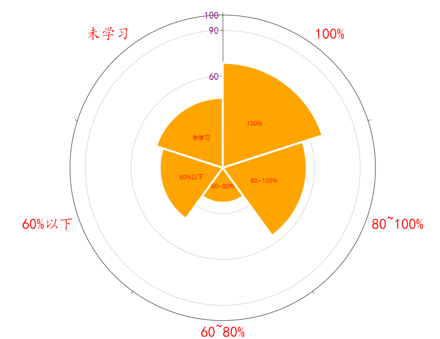
# echarts 玫瑰图
'radius' 扇区圆心角展现数据的百分比,半径展现数据的大小。
'area' 所有扇区圆心角相同,仅通过半径展现数据大小。
option.series = [{
    type: 'pie',
	......
    roseType: 'area',
    // roseType: 'radius',
    label: {
        show: true,
        formatter: '{c}', // 格式化标签内容
        position: 'inside', // 标签位置设置为扇区中心
    },
    data: pieData
}

];
# echarts legend
# 图例文字颜色自定义
如果图例的字需要自定义颜色,需要结合formatter和textStyle中的rich去自定义
    legend: {
        orient: 'vertical',
        icon: icon, // rect
        itemWidth: itemWidth,  // 设置宽度
        itemHeight: itemHeight, // 设置高度
        top: '10%',
        bottom:"10%",
        right: 'right',
        textStyle: Object.assign({
            padding: [0, 0, 0, lengedGap]
        }, textStyle,{
			// 如果设置auto,没有设置rich,那么默认文本会以图例的自身颜色渲染
            color:"auto",
			// 但是使用 color为'auto'需要注意的是,如果需要对文字样式进行格式化处理的话,
			// 必须把自定义样式rich放在后面,否侧color为'auto'会被覆盖,
			// 而且rich之后未设置样式的文本也会被覆盖成rich的颜色
            rich: richObject
            // rich:{
            //     styleLabel:{
            //         color:'#FFF',
            //         fontSize:10,
            //     }
            // }
        }),
        // itemGap: layout.itemGap.columnGap,
        selectedMode: selectedMode,
        align: 'left',
        orient: 'horizontal',
        show: true,
        // itemGap: 10,
        formatter:function(params){
			//styleMap是存储数据时的一个Map对象
            const index = styleMap.get(params)
            const legendHTML = `{styleLabel|${params}}  {styleValue${index}|${seriesData[index].value}}  {stylePrecent${index}|${(seriesData[index].value/sum*100).toFixed(0)}%}`

            return legendHTML
        }
    }
# echarts tooltip
如果某个系列不需要展示数据,可进行格式化配置
tooltip: {
	// trigger item:散点图 饼图无类目轴图标使用
	// axis 柱状图 折线图
    trigger: 'item',
	// 突出背景,指示器的样式
	axisPointer: {
			type: 'line',
			lineStyle: {
				type: 'solid', // 设置线条类型为实线
				color: xxx, // 设置指示器颜色
				width: yyy // 设置指示器线条宽度
			},
	},
    formatter:function(params){
       if (params.seriesName === '系列1') {
        return params.seriesName + '<br/>' + params.name + ' : ' + params.value + ' (' + params.percent + '%)';
      }
      // 系列2不返回任何内容,因此不会显示 tooltip
      return '';
    }
  },
# radiusAxis
极坐标系的径向轴。
# angleAxis
极坐标系的角度轴。
	angleAxis: {
		type: 'category',
		data: ['100%', '80~100%', '60~80%', '60%以下', '未学习'],
		axisLabel:{
			color:"red",
			fontFamily:"楷体",
			fontSize:30,
		}
	},
	radiusAxis: {
		min: 0,
		max: 100,
		interval: 30,
		axisLabel:{
			color:"purple",
			fontFamily:"楷体",
			fontSize:20,

		}
	},
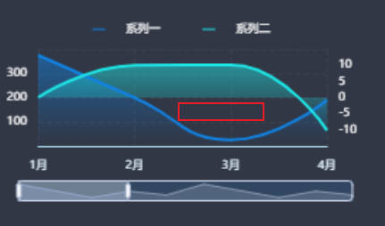
# echarts dataZoom
使用start end做折线图轮播时,动画效果较差,会有明显闪出闪入,使用startValue和endValue,效果更好
# echarts serires
# line-areaStyle
默认情况下,如果数据出现负数,就会出现绿色(有一段时负值)line绘制的曲线,导致出现空白
series-line.areaStyle. origin  = 'auto'
图形区域的起始位置。
默认情况下,图形会从坐标轴轴线到数据间进行填充。如果需要填充的区域是坐标轴最大值到数据间,或者坐标轴最小值到数据间,或者某个数值到数据间则可以通过这个配置项进行设置。
可选值包括:
- 'auto' 填充坐标轴轴线到数据间的区域(默认值)
- 'start' 填充坐标轴底部(非 inverse 情况是最小值)到数据间的区域
- 'end' 填充坐标轴顶部(非 inverse 情况是最大值)到数据间的区域
- number 填充指定数值到数据间的区域(从 v5.3.2 开始支持)
 option.series.push({
		name: 'Data1',
		type: 'line',
		data: item,
		areaStyle: {
			origin:"start",
			color: new echarts.graphic.LinearGradient(0, 0, 0, 1, [
			 {
				offset: 1,
				color: 'rgba(42,157,255,1)'
			  },
			  {
				offset: 0,
				color: 'rgba(42,157,255,0.8)'
			  }
			])
		},

	})
# echarts案例
<!DOCTYPE html>
<html lang="zh">
<head>
	<meta charset="UTF-8">
	<meta name="viewport" content="width=device-width, initial-scale=1.0">
	<title>Document</title>
	<script src="./换肤_files/echarts.js"></script>
	<style>
		*{margin:0;padding:0}
		#k{
			width:400px;
			height:400px;
			border:1px solid purple
		}
		@keyframes rotate-forever {
		  from {
		    transform: rotate(0deg);
		  }
		  to {
		    transform: rotate(360deg);
		  }
		}
	</style>
</head>

<body>
	<div id='k'></div>
	<div>echarts</div>
</body>
</html>
<script>
	var chartDom = document.getElementById('k');


	var myChart = echarts.init(chartDom);
	var kchild = document.createElement("div")
	kchild.innerHTML='xxx'
	chartDom.appendChild(kchild);
	chartDom.style.cssText += 'postion:relative;'

	kchild.style.cssText = 'position:absolute;top:0;width:400px;height:400px;animation: rotate-forever 2s linear infinite;'

	var myChart1 =echarts.init(kchild)

	var option;
	var option1;

	option = {
	  title: {
	    text: 'Referer of a Website',
	    subtext: 'Fake Data',
	    left: 'center'
	  },
	  tooltip: {
	    trigger: 'item'
	  },
	  legend: {
	    orient: 'vertical',
	    left: 'left'
	  },
	  series: [
	    {
	      name: 'Access From',
	      type: 'pie',
	      radius: ['40%', '60%'],
	      data: [
	        { value: 1048, name: 'Search Engine' },
	        { value: 735, name: 'Direct' },
	        { value: 580, name: 'Email' },
	        { value: 484, name: 'Union Ads' },
	        // { value: 300, name: 'Video Ads' }
	      ],
	      label: {
	        show: false
	      },
	      emphasis: {
	        show: false,
	        scale: false
	      }
	    }
	  ]
	};
	option1={

		series: [
		  {
		    name: 'Access From',
		    type: 'pie',
		    radius: ['20%', '30%'],
		    itemStyle: {
		      opacity: 0.35
		    },
		    data: [
		      { value: 1048, name: 'Search Engine' },
		      { value: 735, name: 'Direct' },
		      { value: 580, name: 'Email' },
		      { value: 484, name: 'Union Ads' },
		      { value: 300, name: 'Video Ads' }
		    ],
		    label: {
		      show: false
		    },
		    emphasis: {
		      show: false,
		      scale: false
		    }
		  }
		]
	}
	option && myChart.setOption(option);
	option1 && myChart1.setOption(option1);
</script>