# css学习
# vertical-align
vertical-align 用来指定行内元素(inline)或表格单元格(table-cell)元素的垂直对齐方式。
img.bottom {
  vertical-align: text-bottom;
}
img.middle {
  vertical-align: middle;
}
# margin负值
<!DOCTYPE html>
<html>
	<head>
		<meta charset="utf-8" />
		<meta name="viewport" content="width=device-width, initial-scale=1">
		<title></title>
		<style>
			*{
				margin:0;
				padding:0
			}

			.k1{
				width:100px;
				height:100px;
				border:1px solid red;
				background-color: red;
			}
			.k2{
				width:100px;
				height:100px;
				border:1px solid green;
				background:green
			}
			.k3{
				width:100px;
				height:100px;
				border:1px solid blue;
				background:blue
			}
			.k{
				width:400px;
				height:400px;
				border:1px solid antiquewhite;
				/* 控制是否是水平方向的布局 */
				/* display: flex; */
			}
		</style>
	</head>
	<body>
		<div class='k'>
			<div class='k1'></div>
			<div class='k2'></div>
			<!-- <div class='k3'></div> -->
		</div>

	</body>
</html>
<script type="text/javascript">
	let k1 =document.getElementsByClassName('k1')[0]
	let k2 =document.getElementsByClassName('k2')[0]
	k1.onclick=function(){
		alert('k1')
	}
	k2.onclick=function(){
		alert('k2')
	}
</script>
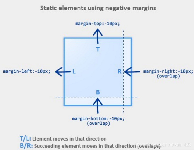
- 上下布局
- k1 margin-top 负值,k1往上移动,k2跟随移动对应距离
- k2 margin-top 负值,k1不动,k2往上移动,层级比k1高,可覆盖点击不到K1的事件
- k1 margin-bottom 负值 k1不动 k2往上移动
- k2 margin-bottom 负值 k2不动,k2后如果有相邻的元素比如k3存在,则会向上移动
- 左右布局
- k1 margin-left 负值 k1往左移动,k2跟随移动对应距离
- k2 margin-left 负值 k1不动,k2 往左移动,层级比k1高
- k1 margin-right 负值 k1不动 k2往左移动
- k2 margin-right 负值 k2不动 k2后如果有相邻的元素比如k3存在,则会向左移动
圣杯布局的情况:当right的100px,margin-right:-100px;相当于告诉浏览器这个div体积为0,那么就自动顶到右侧位置(margin-right假设后面有元素,那么从视图层看上去设置的元素width渐渐变小直到为0)
# line-hieght
line-height 属性设置行间的距离(行高)。
注释:不允许使用负值。
| 值 | 描述 |
|---|---|
| normal | 默认。设置合理的行间距。 |
| number | 设置数字,此数字会与当前的字体尺寸相乘来设置行间距。 |
| length | 设置固定的行间距。 |
| % | 基于当前字体尺寸的百分比行间距。 |
| inherit | 规定应该从父元素继承 line-height 属性的值。 |
# line-height继承
- 写具体数值,如30px,则继承父级该值
- 写比例如1/2/3.5等,则继承该比例(自己的font-size*父级中的比例)
- 写百分比,如200%,则继承计算出来的结果(父级的font-size*200%)
<!DOCTYPE html>
<html>
<head>
    <meta charset="UTF-8">
    <meta name="viewport" content="width=device-width, initial-scale=1.0">
    <meta http-equiv="X-UA-Compatible" content="ie=edge">
    <title>line-height 继承问题</title>
    <style type="text/css">
        body {
            font-size: 20px;
            line-height: 200%;
        }
        p {
            background-color: #ccc;
            font-size: 16px;
        }
    </style>
</head>
<body>
	<!-- line-height 40px -->
    <p>这是一行文字</p>
</body>
</html>
<!DOCTYPE html>
<html>
<head>
    <meta charset="UTF-8">
    <meta name="viewport" content="width=device-width, initial-scale=1.0">
    <meta http-equiv="X-UA-Compatible" content="ie=edge">
    <title>line-height 继承问题</title>
    <style type="text/css">
        body {
            font-size: 20px;
            line-height: 2;
        }
        p {
            background-color: #ccc;
            font-size: 16px;
        }
    </style>
</head>
<body>
	<!-- line-height 32px -->
    <p>这是一行文字</p>
</body>
</html>
# css换肤
/* 默认主题色 */

$theme-default: (

  t-color-primary : (
    color: #FF5777
  ),

  t-shadow : (
    shadow: 0 0 8px #FF5777
  ),

  t-border : (
    border: 1Px solid #FF5777
  )
)
const changeTheme = style => {
    let theme = '';
    if(style == 'default') {
    theme = 'default'
    }else if(style == 'warm'){
    theme = 'warm'
    }else{
    theme = 'cool'
    }
    data.show = !data.show;
    data.showPop = !data.showPop;
    window.document.documentElement.setAttribute(
    "data-theme",
    theme
    );
    }
$themes: (
  default: $theme-default,
  cool: $theme-cool,
  warm: $theme-warm
);

@mixin themable {
  @each $section, $map in $themes {
    $map: $map !global;
    [data-theme="#{$section}"] & {
      @content;
    }
  }
}
参考链接1 (opens new window) 参考链接2 (opens new window)
# 项目中换肤
/* var.scss */
/** 根据设计规范定义全局变量声明 **/
// 跟主题无关的变量放到root里
:root {
    // 后续
    --text-hover-color:#40A9FF;
}
// // 跟主题相关变量,通过属性选择器提升优先级
html[data-theme='light']:root {
    --bg-color:#FFF;
}
html[data-theme='dark']:root {
    --bg-color:#000;
	--container-bg:url('../assets/images/bg.png') repeat repeat;
}
$bg-color:var(--bg-color);
/* common.scss */
.ant-radio-wrapper {
	color:$bg-text-color-main
}
// 项目全局引入
import "@/styles/var.scss";
import "@/styles/common.scss";
// 页面使用
<html lang="en" data-theme="dark"></html>
const changeTheme =()=>{

	if(document.documentElement.getAttribute('data-theme') === 'dark'){
		document.documentElement.setAttribute('data-theme','light')
		eventBus.emit('changeTheme','light')
	}else{
		document.documentElement.setAttribute('data-theme','dark')
		eventBus.emit('changeTheme','dark')
	}
}
# css视差滚动效果
可以尝试用 CSS 3 的 perspective 属性,在网页简单实现这种效果。
首先让滚动发生在父元素的内部,并给父元素加上 perspective: 1px,让父元素获得三维的观察视角。
.container {
  width: 100vw;
  height: 100vh;
  overflow-x: auto;
  overflow-y: hidden;
  perspective: 1px;
}
然后再给不同元素分别加上不同的 transform 属性,translateZ 值调节元素在 Z 轴的位置(近大远小),同时配合 scale 值让元素的大小看起来和原来无异。那么就实现了滚动过程中,不同元素看起来的运动速度不同。
.img-1 {
  transform: translateZ(-1px) scale(2); //变慢两倍
}
.img-2 {
  transform: translateZ(-2px) scale(3); //变慢三倍
}
.text-1 {
  transform: translateZ(0.5px) scale(0.5); //变快两倍
}
<!DOCTYPE html>
<html lang="en">

<head>
  <meta charset="UTF-8" />
  <meta name="viewport" content="width=device-width, initial-scale=1.0" />
  <meta http-equiv="X-UA-Compatible" content="ie=edge" />
  <style>
    html,
    body {
      margin: 0;
      font-family: Helvetica, "PingFang SC",
        "Microsoft Yahei", sans-serif;
        background:#00b894;
        display: flex;
        justify-content: center;
        align-items:center;
        height:100vh;
    }
    * {
      box-sizing: border-box;
    }
    .container {
      width: 50vh;
      height: 50vh;
      overflow-x: hidden;
      overflow-y: scroll;
      perspective: 1px;
    }

    .parallax-child {
      width:50vh;
      height:50vh;
      border:1px solid black;
      transform: translateZ(-2px) scale(3);
      background:rgba(255,255,255,0.5)
    }
    .another{
      width:50vh;
      height:50vh;
      border:1px solid black;
      background:rgba(0,0,0,0.5)
    }
  </style>
</head>
<body>
  <div class="container">
    <div class="parallax-child"></div>
    <div class="another">2333333333333333</div>
  </div>
</body>
</html>
# 视差滚动另一种实现 background-attachment
<!DOCTYPE html>

<html>

	<head>

		<meta charset="UTF-8">

		<meta http-equiv="X-UA-Compatible" content="IE=edge">

		<meta name="viewport" content="width=device-width, initial-scale=1.0">

		<title>文本</title>

		<style>
			* {

				margin: 0;
				padding: 0;

			}

			div {
				height: 800px;
				background-position: center;
				background-repeat: no-repeat;
				background-size: cover;
				background-attachment: fixed;

			}

			.h1 {
				background-image: url(get_files/1.jpg);
			}
			.h2 {
				background-image: url(get_files/2.jpg);
			}
			.h3 {
				background-image: url(get_files/3.jpg);
			}
		</style>

	</head>

	<body>

		<div class="h1">11</div>

		<div class="h2">22</div>

		<div class="h3">33</div>

	</body>

</html>
# CSS动画与性能
Composite:cpu=>GPU显示到屏幕上(GPU触发的是合成层)
通过网站给出的分析,来判断css属性经历过渲染的几个步骤
https://csstriggers.com/
硬件加速触发条件:css属性为元素生成Layer,layer作为texture上传GPU
- 避免交错读写样式
// 触发一次 Layout
var h = div.clientHeight
div.style.height = h + 20
// 再次触发 Layout
var w = div.clientWidth
div.style.width = w + 20
因为浏览器需要给你返回正确的宽高,上述代码片段中每次 Layout 触发都会阻塞当前脚本。 如果把交错的读写分隔开,就可以减少触发 Layout 的次数:
// 触发一次 Layout
var h = div.clientHeight
var w = div.clientWidth
div.style.height = h + 20
div.style.width = w + 20
# js动态添加css style
//某个已经添加到页面的元素
    cache.kchild1.style.cssText = 'position:absolute;zIndex:10;top:0;width:420px;height:210px;animation: rotate-forever 2s linear infinite;'
    const keyframes = `@keyframes rotate-forever {
            from {
                transform: rotate(0deg);
            }
            to {
                transform: rotate(360deg);
            }
        }`;

        // 获取 style 标签
       const styleElement = document.createElement('style');
       // 设置 style 元素的 type 属性
        styleElement.type = 'text/css';

        // 将 keyframes 添加到 style 标签中
		console.log(styleElement.styleSheet)
        if (styleElement.styleSheet) {
            // 对于 Firefox  不过styleElement.styleSheet似乎走不进来,
            styleElement.styleSheet.cssText = keyframes;
        } else {
            styleElement.appendChild(document.createTextNode(keyframes));
        }
        // 获取 head 元素
        const head = document.head || document.getElementsByTagName('head')[0];
        // 将 style 元素附加到 head 元素
        head.appendChild(styleElement);
# @emotion/css
@emotion/css 是一个与框架无关的样式应用包,它是 Emotion 库的一部分。Emotion 是一个专为使用 JavaScript 编写 CSS 样式而设计的库,它提供了强大且可预测的样式组合,以及源映射、标签和测试实用程序等功能,为开发人员提供了出色的体验。
使用 @emotion/css,你可以通过 JavaScript 动态地定义和修改样式,而无需关心 CSS 的相关适配问题。你只需要使用 css 函数生成类名并编写样式即可。这种方式使得样式更加模块化和可复用,同时也便于与 React 等前端框架集成。
npm install @emotion/css
# 或者
yarn add @emotion/css
在你的 JavaScript 文件中引入 css函数。
import { css } from '@emotion/css';
使用 css 函数来定义样式,并生成一个类名。
const buttonStyle = css`
  background-color: blue;
  color: white;
  padding: 10px;
`;
将这个类名应用到你的 HTML 元素或 React 组件上。
<button className={buttonStyle}>Click me</button>
@emotion/css 还支持在样式中嵌入 JavaScript 表达式来动态设置样式属性。
const dynamicColor = (theme) => theme.palette.primary.main;
const dynamicStyle = css`
  background-color: ${dynamicColor};
  color: white;
  padding: 10px;
`;
cx是一个用于组合类名的函数。它允许你将多个由@emotion/css生成的类名组合在一起,并应用到同一个元素上。这样做的好处是,你可以将样式拆分成更小的、可复用的部分,然后在需要的时候将它们组合起来使用。
cx函数会检测由@emotion/css生成的类名,并确保样式按正确的顺序覆盖。这是因为它会考虑类名的特异性(specificity)和顺序,以确保后续样式能够覆盖前面的样式属性值。
import { css, cx } from '@emotion/css';

// 定义两个样式
const cls1 = css`
  font-size: 20px;
  background: green;
`;

const cls2 = css`
  font-size: 20px;
  background: blue;
`;

// 使用 cx 函数组合类名
<div className={cx(cls1, cls2)}>
  这个 div 会应用 cls1 和 cls2 的样式,但 cls2 的背景色会覆盖 cls1 的背景色。
</div>
# 一些其他css知识
# -webkit-box-reflect
CSS 属性可让你将元素内容在特定方向上进行轴对称反射。
非标准: 该特性是非标准的,请尽量不要在生产环境中使用它!
# currentcolor
currentcolor 关键字表示元素的 color 属性的值。这允许你在默认情况下不接收 color 值的属性上使用 color 值。
如果 currentcolor 用于 color 属性的值,则它将从 color 属性的继承值中获取其值。
<div style="color: blue; border: 1px dashed currentcolor;">
  这个文本的颜色是蓝色。
  <div style="background: currentcolor; height:9px;"></div>
  这个块的边框也是蓝色。
</div>